Styling radio button with Tailwind
React Radio button component (styled) from scratch
Another post after this one about styling with Tailwind. Similar like with the checkbox element we will go step by step to restyle the radio button.
The whole code can be found in this GitHub repository: https://github.com/marekrozmus/blog-styling-react-radio-button-with-tailwind

Styling step by step
This is what we start with:
const Radio = () => (
  <div>
    <input type="radio" />
    <label>This is the radio label</label>
  </div>
);
Now add an id so that we can make the label clickable:
const Radio = ({ id }: RadioProps) => (
  <div>
    <input type="radio" id={id} />
    <label htmlFor={id}>This is the radio label</label>
  </div>
);
Styling
To remove the default styling use appearance-none class.
<input type="radio" id={id} className="appearance-none" />The radio will disappear — it needs to be design from scratch.
The radio button
Adding the width, height, some colour of the border and making it round. If we won’t make it round it will look rather like checkbox — a square.
<input type="radio" id={id}
  className="
    appearance-none
    w-4 h-4 border-2 border-blue-500 rounded-full
  "
/>
Alignment fixes
It looks a little bit off. Some alignment here and there is needed to make it look ok. A simple fix can be applied to the parent div and we will have something like this:
<div className="flex gap-2 items-center">
  <input type="radio" id={id}
    className="
      appearance-none
      w-4 h-4 border-2 border-blue-500 rounded-full
    "
  />
  <label htmlFor={id}>This is the radio label</label>
</div>
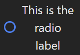
Fixed! Right? Well, that depends. Check what happens if we will have long label and the text wrapping will take place:

First of all our button shrinked, that can be easily fixed by adding shrink-0 to the button styles.

Now the question if we are ok with having the button in the middle or rather on the top. I prefer having it on the top so depends on the font size I add some top margin and align all to top (remove items-center ).
<div className="flex gap-2">
  <input type="radio" id={id}
    className="
      appearance-none shrink-0 mt-1
      w-4 h-4 border-2 border-blue-500 rounded-full
    "
  />
  <label htmlFor={id}>This is the radio label</label>
</div>
Add checked state
The check element needs to be placed inside the circle. So a check element appearance needs to be defined and absolute usage is needed to place it in proper place.
<input type="radio" id={id}
  className="
    relative
    appearance-none shrink-0 mt-1
    w-4 h-4 border-2 border-blue-500 rounded-full
  "
/>
<div
  className="
    absolute
    w-2 h-2 rounded-full bg-blue-500
  "
/>
<label htmlFor={id}>This is the radio label</label>
A simple circle with same colour, added but looks like some more alignment is needed:

Adding some margins and we got it:
<div className="
  absolute
  w-2 h-2 rounded-full bg-blue-500 ml-1 mt-2"
/>
I am not a fan of using margins to layout something. If we change the button’s width then we would need also to update those margins:

I am not also a fan of using absolute positioning, so maybe there is other way to get rid of that?
The grid placement
Other way is to put both — the button and the check element in one grid cell and use centre alignment. All margins and absolute are not needed anymore.
<div className="grid place-items-center">
  <input type="radio" id={id}
    className="
      col-start-1 row-start-1
      appearance-none shrink-0
      w-4 h-4 border-2 border-blue-500 rounded-full
    "
  />
  <div
    className="
      col-start-1 row-start-1
      w-2 h-2 rounded-full bg-blue-500
    "
  />
</div>
And if we change the size of the button, the inner circle will still be in the centre.

Alignment problem is back
After checking new implementation in smaller container we got:

Some tweaking — aligning all to top items-start and (unfortunately) using m-1 for moving the circle a little bit lower.
<div className="flex gap-2 items-start">
  <div className="grid place-items-center mt-1">
    <input type="radio" id={id}
      className="
        col-start-1 row-start-1
        appearance-none shrink-0
        w-4 h-4 border-2 border-blue-500 rounded-full
      "
    />
    <div
      className="
        col-start-1 row-start-1
        w-2 h-2 rounded-full bg-blue-500"
    />
  </div>
  <label htmlFor={id}
    className="text-start">This is the radio label</label>
</div>
The selected and unselected states
To go further we need some changes in the component — add label and defaultChecked . Just showing the places with changes here. For the full code check the repository.
const Radio = ({ defaultChecked, id, label }: RadioProps) => (
...
    <input type="radio" id={id} defaultChecked={defaultChecked}
...
    <label htmlFor={id} className="text-start">{label}</label>
And some component rendering:
<Radio id='radio1' label='Radio 1' defaultChecked />
<Radio id='radio2' label='Radio 2' defaultChecked={false} />
This is not what should be rendered — the second one should not be selected. The problem is that we are missing styling for the unselected state.
The inner circle should be only visible when the checked state is true. So the background colour needs to base on the check state of the input element. This can be done by setting peer class on the input and then adding peer-checked: prefix to the background colour:
<input type="radio" id={id} defaultChecked={defaultChecked}
  className="
    peer
    col-start-1 row-start-1
    appearance-none shrink-0
    w-4 h-4 border-2 border-blue-500 rounded-full
  "
/>
<div
  className="
    col-start-1 row-start-1
    w-2 h-2 rounded-full peer-checked:bg-blue-500
  "
/>
The unchecked button is not clickable
Try to click on the circle of the second radio to select it — nothing happens. Now try to click on the Radio 2 label — it works! What is the problem?
The inner circle that we are rendering prevents click events. To fix it one class needs to be added to inner circle: pointer-events-none . This will tell the element to not grab any click events but to just pass them further.
<div
  className="
    pointer-events-none
    col-start-1 row-start-1
    w-2 h-2 rounded-full peer-checked:bg-blue-500
  "
/>
The disabled state
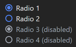
Lets add two more radio buttons:
<Radio id='radio1' label='Radio 1' defaultChecked />
<Radio id='radio2' label='Radio 2' defaultChecked={false} />
<Radio id='radio3' label='Radio 3 (disabled)' defaultChecked disabled />
<Radio id='radio4' label='Radio 4 (disabled)' defaultChecked={false} disabled />
And update the component:
const Radio = ({ defaultChecked, disabled, id, label }: RadioProps) => (
...
    <input type="radio" id={id} defaultChecked={defaultChecked}
      disabled={disabled}
...
The disabled Radio 4 (disabled) cannot be selected — so looks like it works correctly. But the appearance needs to be updated so that user see that the item is disabled. In the inner circle the peer-checked and peer-disabled need to be used.
<input type="radio" id={id} defaultChecked={defaultChecked} disabled={disabled}
  className="
    peer
    col-start-1 row-start-1
    appearance-none shrink-0
    w-4 h-4 border-2 border-blue-500 rounded-full
    disabled:border-gray-400
  "
/>
<div
  className="
    pointer-events-none
    col-start-1 row-start-1
    w-2 h-2 rounded-full peer-checked:bg-blue-500
    peer-checked:peer-disabled:bg-gray-400
  "
/>
But I got disabled in props
Yup, and you can also use the clsx or classnames package and have something like this:
<div
  className={cx(
    "pointer-events-none",
    "col-start-1 row-start-1",
    "w-2 h-2 rounded-full peer-checked:bg-blue-500",
    // "peer-checked:peer-disabled:bg-gray-400"
    {
      "!bg-gray-400": disabled,
    }
  )}
/>
But in this case the ! important needs to be used. So use whatever you like.
One thing that to style also “disabled” label we can use only the prop. It is because the label is not a sibling of the input in this nodes structure so the tailwind peer cannot be used there.
<label htmlFor={id}
  className={cx(
    "text-start",
    {
      "text-gray-400": disabled,
    })}
>
  {label}
</label>
The focused state
So far there is no focus state, so if the element is clicked and focused it is not visible. You can use Tab key to go around the page and get something like this:

This can be changed by adding the focus classes:
<input type="radio" id={id} defaultChecked={defaultChecked} disabled={disabled}
  className="
    peer
    col-start-1 row-start-1
    appearance-none shrink-0
    w-4 h-4 border-2 border-blue-500 rounded-full
    focus:outline-none focus:ring-offset-0 focus:ring-2 focus:ring-blue-400
    disabled:border-gray-400
  "
/>
Now the outline will be visible if you click the item (focus it):

You are still here? check the repository as there is also a full radio group component example with all that was presented here.
Do you like my content? You can support me and buy me a coffee. Thank you so much!

